Hola Grumers!
I’ve revised thousands of lectures from my students and… most suck pelotas!
I mean, good intentions are there, but oh my… the video quality is bad, the audio is horrible, the background is messy, the camera lens is dirty, the delivery is poor, rambling aplenty… you name it, I’ve seen it all.
This makes sense though — 99.99% of new online teachers don’t have experience talking to a camera or dealing with video and audio technical issues.
However, I believe with the right direction and a bit of patience almost anyone can make their online lectures look much more professional.
How?
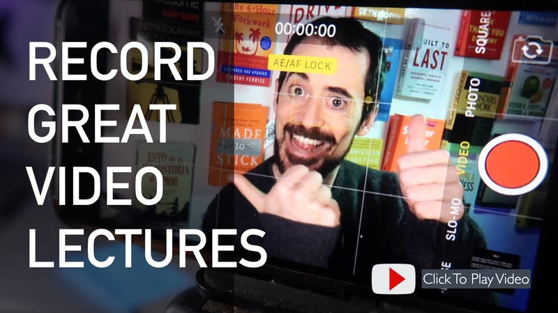
I just published a nice little tutorial with 39 recommendations to make sure your next batch of lessons look 10x better.
You can watch the tutorial here → https://www.youtube.com/watch?v=jPvFAPWUGHQ
You can access the checklist at → https://grumo.com/lessoncheck
If you can honestly check “Yes” to all the items on that list, your next lecture HAS to look good!
Don’t let poor video quality prevent you from sharing your gift with the world.
Peace, Love, and Check-Yes-Cookies,
Miguel @ Grumo.com
P.S: Want feedback on your lectures? If you want with feedback on your lectures you can submit a test lecture privately by scrolling to the bottom of the checklist above.

Leave a Reply